

但縮到手機模式時,表格下方則會出現左右滑動的捲軸,雖然說這也是一個不錯的解決辦法,但在操作上就覺得有些不便,因此還是盡量以條列式的方式來呈現,會比較符合手機上的操控,因此梅干就整理了一下手邊的資料,將table自適應並整合到bootstrap中,因此一樣可在bootstrap的grid system的系統來使用,完全沒問題,因此當有需要使用table表格式,不妨也可參考看看囉!
放在<style>…</style>之間:
.rwd-table {
background: #fff;
overflow: hidden;
}
.rwd-table tr:nth-of-type(2n){
background: #eee;
}
.rwd-table th,
.rwd-table td {
margin: 0.5em 1em;
}
.rwd-table {
min-width: 100%;
}
.rwd-table th {
display: none;
}
.rwd-table td {
display: block;
}
.rwd-table td:before {
content: attr(data-th) " : ";
font-weight: bold;
width: 6.5em;
display: inline-block;
}
.rwd-table th, .rwd-table td {
text-align: left;
}
.rwd-table th, .rwd-table td:before {
color: #D20B2A;
font-weight: bold;
}
@media (min-width: 480px) {
.rwd-table td:before {
display: none;
}
.rwd-table th, .rwd-table td {
display: table-cell;
padding: 0.25em 0.5em;
}
.rwd-table th:first-child,
.rwd-table td:first-child {
padding-left: 0;
}
.rwd-table th:last-child,
.rwd-table td:last-child {
padding-right: 0;
}
.rwd-table th,
.rwd-table td {
padding: 1em !important;
}
}
放在<body>…</body>之間:
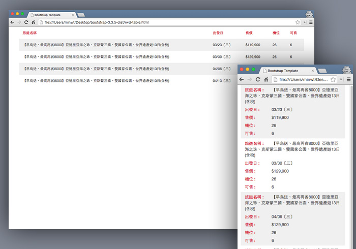
當要使用時,在table加入.rwd-table的class名稱,接著在每個td後方加入data-th的自訂屬性名稱,當縮小到手機尺寸時,則會透過CSS3的選擇器,將data-th的值寫到區塊中,當手機模式,就會依照條列式的方式作呈現。
<tr>
<th>旅遊名稱</th>
<th>出發日</th>
<th>售價</th>
<th>機位</th>
<th>可售</th>
</tr>
<tr>
<td data-th="旅遊名稱">【早鳥送、最高再省8000】亞德里亞海之珠、克斯蒙三國、雙國家公園、世界遺產遊13日(含稅) </td>
<td data-th="出發日">03/23〔三〕 </td>
<td data-th="售價">$119,900</td>
<td data-th="機位">26</td>
<td data-th="可售">6</td>
</tr>
</table>
[範例預覽] [範例下載]